Graphing
- Click to view a checklist for completing graphs.
- Click to learn how to graph in Excel.
- Click to learn how to graph in Sheets.
- Click to learn about interpreting error bars on graphs.
- Click to read a short article about the effective use of graphs.
|
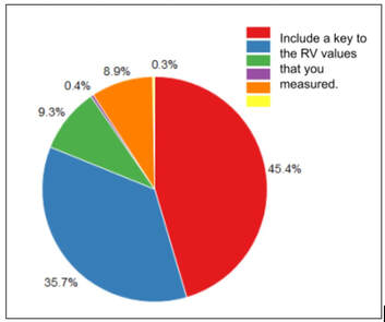
Pie Chart
|
You do not have levels of manipulation and you had a qualitative responding variable. You will create a pie chart of your results
|
|
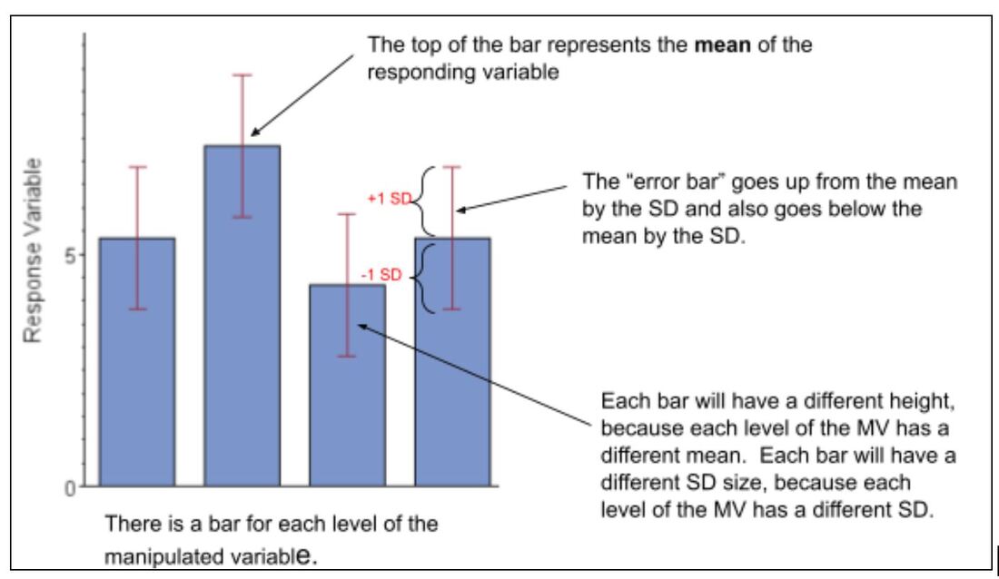
Bar Graph
|
You have a qualitative manipulated variable and quantitative responding variable. Your data was not skewed (meaning it fit a normal distribution). You have calculated the mean as a measure of central tendency and the standard deviation as a measure of spread. That means, you will be creating a bar chart with standard deviation “error” bars. If you had less than 5 trials for each level of your manipulated variable, then you will use the RANGE for the “error” bar instead of the standard deviation.
|
|
Box and Whisker
|
You calculated the median as a measure of central tendency and the interquartile range as a measure of spread. You will create a box and whisker graph of your results.
Ex: Comparison of the mean reaction rate for five different enzymes 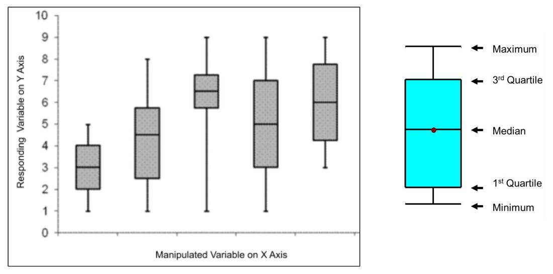
|
|
Histogram
|
|
Histograms are similar to bar graphs except the data represented in histogram is usually in groups of continuous numerical (quantitative) data. In this case, the bars do touch. Histograms are often used to show frequency data.
Ex: Minimum Decibels (dBA) of sound heard by 20 people |
|
Scatter Plot
|
You have qualitative variables but you did not manipulate a variable or collect multiple trials of data. That means you will be creating a scatter plot chart. You might want to add a trendline (see below),
|
|
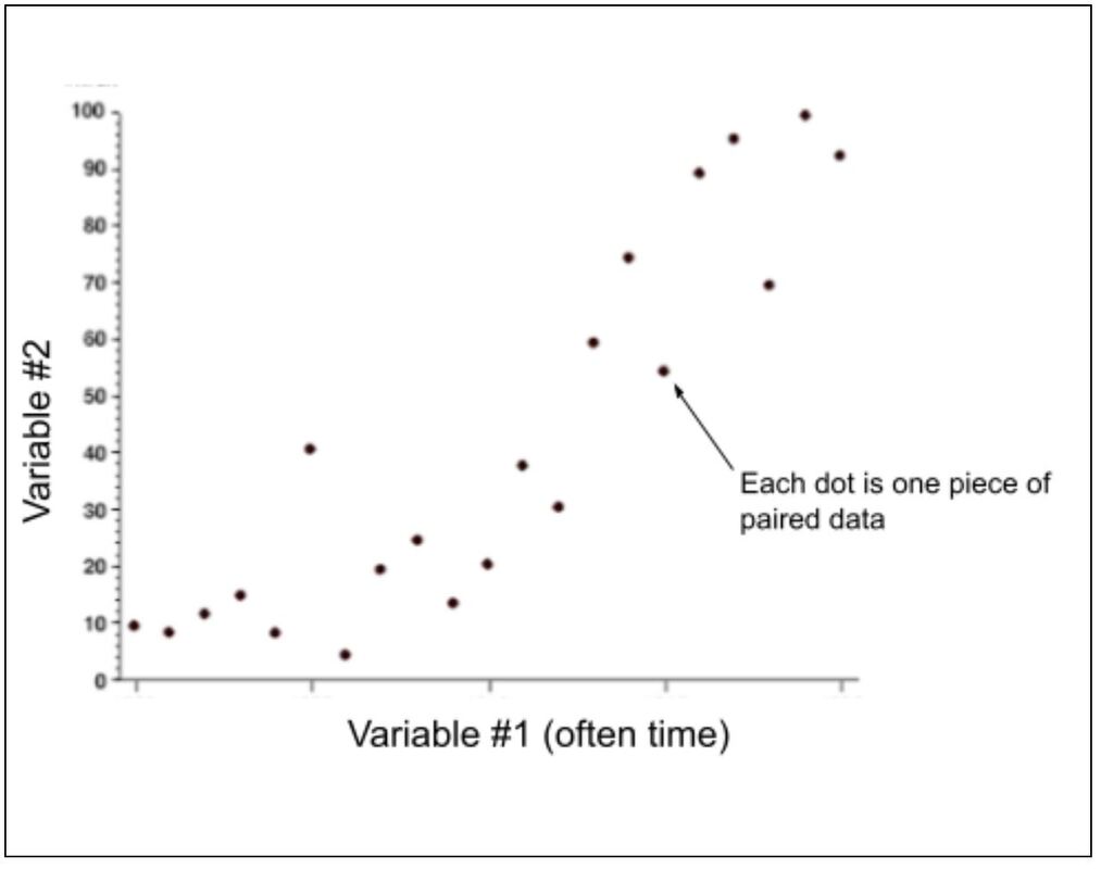
Scatter Plot
with Means |
You have quantitative manipulated variable levels and a quantitative responding variable. You have calculated the mean as a measure of central tendency and the standard deviation as a measure of spread. That means you will be creating a scatter plot chart with standard deviation “error” bars. You might want to add a trendline (see below),
Ex: Reaction rate at various enzyme concentrations 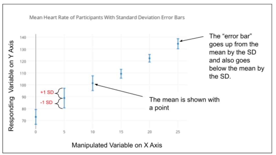
|
|
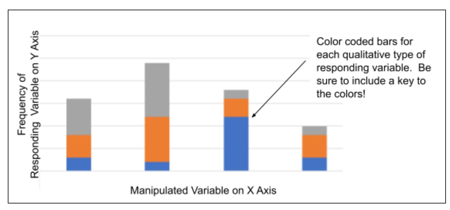
Stacked Bar
|
You have levels of manipulation and a qualitative responding variable. You will create a stacked bar graph of the frequency of your results.
|
How to Graph
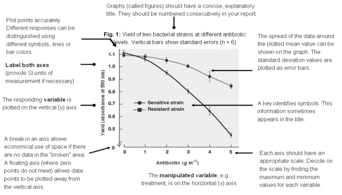
- Determine the manipulated and responding variables. In an experiment the experimenter will set up a set of conditions, it may be a range of temperatures or pH values, or, more common, the experimenter may choose to observe the experiment proceeding at set intervals of time (seconds, days or even years). These are the manipulated variables and always go on the horizontal axis (x—axis). The effect of the experimenter varying the manipulated variable is measured as the responding variable (the part of the experiment under observation), this is always plotted on the vertical axis (y—axis or ordinate).
- Note the units of measurement for each of the variables. Non- metric units such as Fahrenheit (°F) should be avoided in science. It is important to indicate to your audience in what unit you are actually measuring your variables. The units of measurement are presented behind the label of the axis, e.g. Temperature (°C)
- The proportions of the axes. The area enclosed by the axes should be roughly square and not disproportionately exaggerated
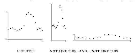
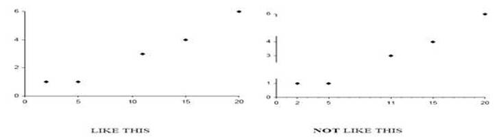
- Mark the quantities on both axes and number them at regular intervals. Your axis intervals do not have to be the same on the x and y axis and they do not have to always start at the origin with a value of 0.
- Giving the graph a title. The graph must have a title which should contain a brief description of what is being investigated. Other information which may go in the title, if available, includes: the date, place and name of experimenter or collector of the data. If there is more than one graph a reference number or letter is required. For example: “Fig 2: A graph showing the change in testis weight throughout the year in the brown rat (Rattus rattus)” IS BETTER THAN... “A graph of testis weight against time” which is insufficient. Underline or use bold type for your title it makes it stand out and is easier to find on the page.
- Plotting more than one graph on a set of axes. Sometimes two or three sets of data (though rarely more) are plotted within the same set of axes. You must distinguish between them by using different symbols (X, Ο, , ∇ etc) or lines (…………., ________, -----------, etc). Use a key by the side of the graph which explains the symbols or lines. Do not write on the graph itself though labels and arrows may be useful. You may wish to plot data from two different responding variables together on one graph but the values may be so different you have to use two different scales. One axis can be placed on each side of the graph.
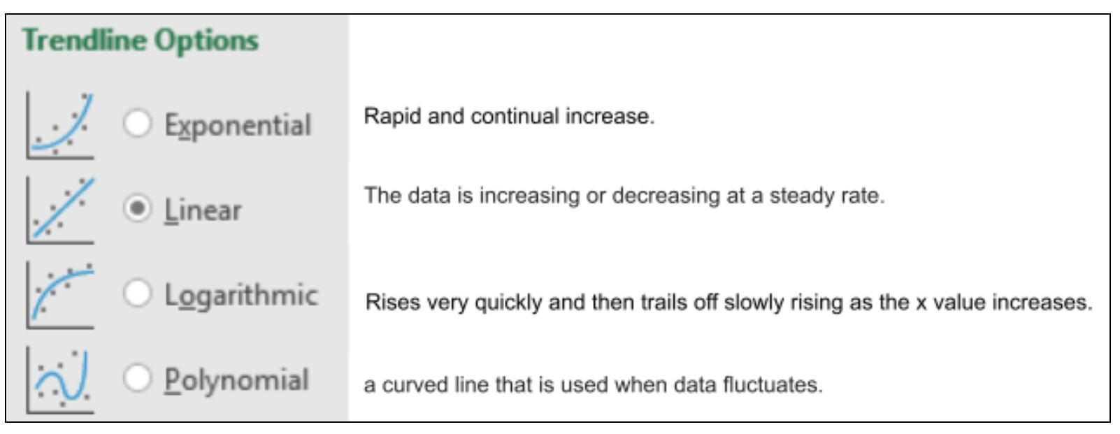
Adding a Trendline
You have created a graph that might need a trendline. Look at the points on the graph and make an estimation of which, if any, shape of trendline best fits your data: